
R Basics – Data Analysis Part 4 – Charts
We can analyze data loaded and corrected in R using statistics and display them in various charts. In this part of the course, we will learn about some functions that allow us to graph our results. For this exercise we will use information about the population in Polish districts (download) that was used earlier in the course.
First, we will load the data into R:
|
1 |
data = read.table('D:/population.txt', header = TRUE, sep = '\t', stringsAsFactors = FALSE) |
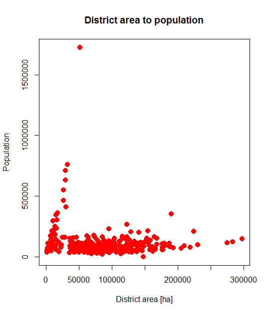
We start with the simplest dot plot, which shows the size of the district on the X-axis and the population on the Y-axis. The plot() function is used to represent information using points. The general form of this function is as follows:
|
1 |
plot (data on the x axis, data on the y axis) |
Both sets of data must have the same size. Let’s display an example plot using our data:
|
1 |
plot(data$area_ha,data$population) |

Let’s add a title to the plot with:
|
1 |
title('District area to population') |

We can freely change the appearance of the dot plots by adding arguments in the plot() function:
- main – the name of the plot,
- col – color of the points,
- pch – symbol of the points,
- cex – size of the points,
- xlab – description of the x-axis,
- ylab – description of the y-axis.
Let’s add some additional arguments to our plot and display the result:
|
1 |
plot(data$area_ha, data$population, main = 'District area to population', col = 'red', pch = 20, cex = 2, xlab = 'District area [ha]', ylab = 'Population') |
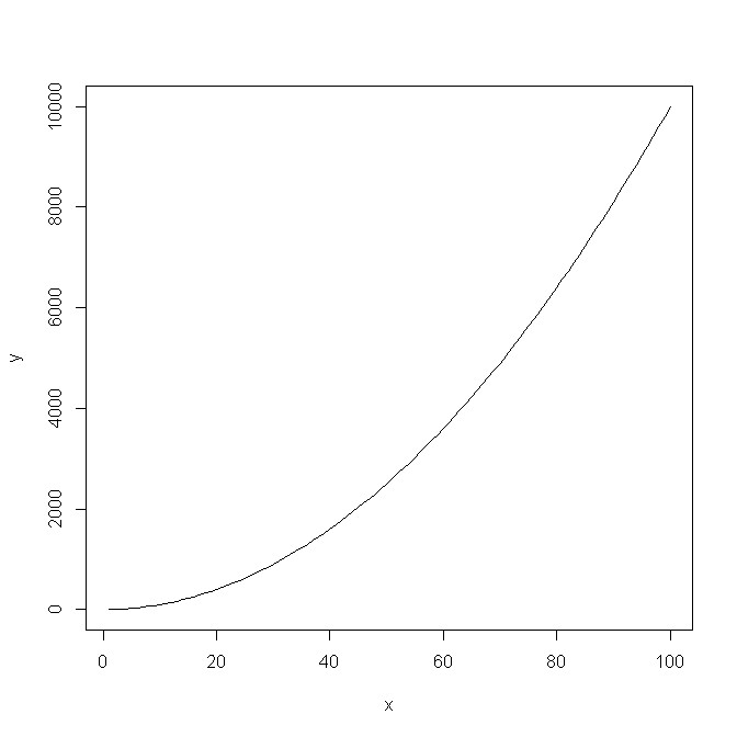
What if we don’t want to plot points, but lines? We need to use the same plot() function with an additional type attribute that specifies the chart type equal to ‘l’.
First, let’s count the data we want to plot linearly, such as the graph of a power function:
|
1 2 |
x = c(1:100) y = x^2 |
Let’s plot the results with a line graph:
|
1 |
plot(x,y,type = 'l') |
The second type of useful charts are histograms. To plot them, the hist() function is used. Let’s create a histogram for the population in districts:
|
1 |
hist(data$population) |

The number of breaks in the default histogram is too small to represent our data well. We can increase their number by using the breaks argument, which specifies the number of intervals:
|
1 |
hist(data$population, breaks = 100) |

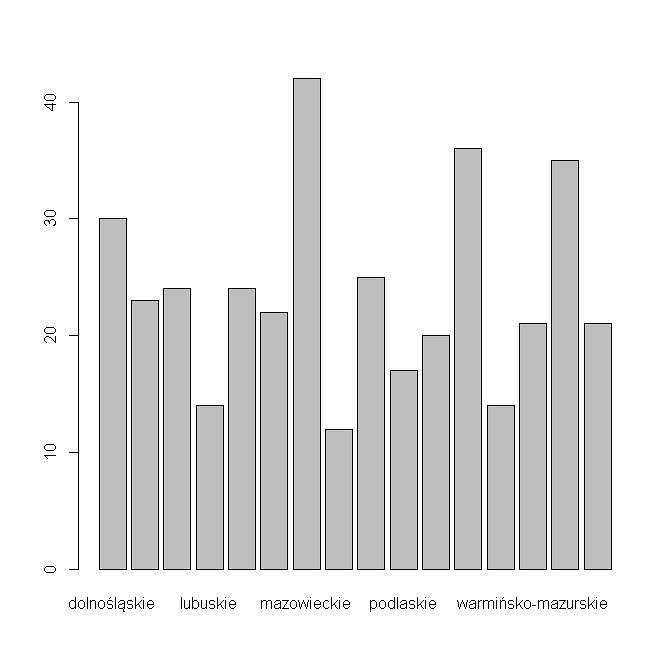
Bar charts are quite useful in data analysis. The barplot() function is used to create them. Let’s first calculate the data we can plot with this type of chart, for example, the number of districts in the voivodships:
|
1 2 3 4 5 6 7 8 |
district_sum = table(data$voivodeship) district_sum dolnoslaskie kujawsko-pomorskie lodzkie lubelskie lubuskie malopolskie mazowieckie opolskie 30 23 24 25 14 22 42 12 podkarpackie podlaskie pomorskie slaskie swietokrzyskie warminsko-mazurskie wielkopolskie zachodniopomorskie 25 17 20 36 14 21 35 21 |
We plot the calculated data with a barplot:
|
1 |
barplot(district_sum) |
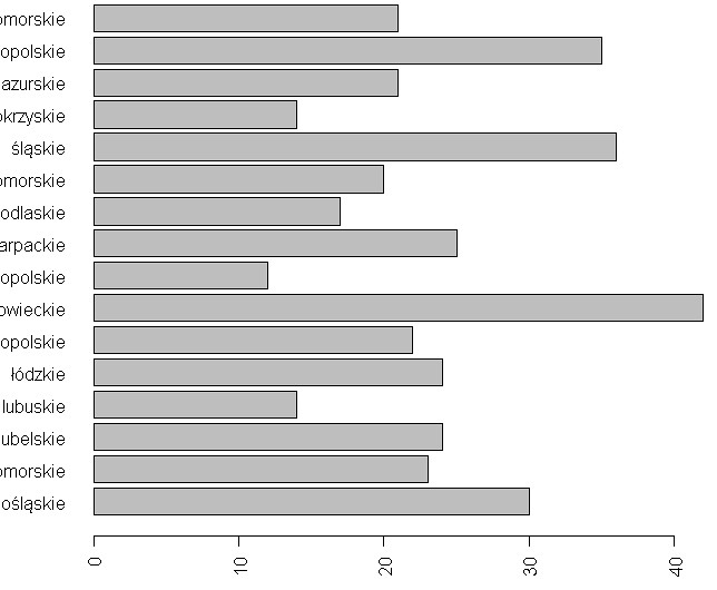
We can also change the bar chart using function attributes. In our chart, we change the display direction of the descriptions on the X-axis (the las argument) and the display type of the chart to horizontal (the horizon argument):
|
1 |
barplot(district_sum, horiz = TRUE, las = 2) |
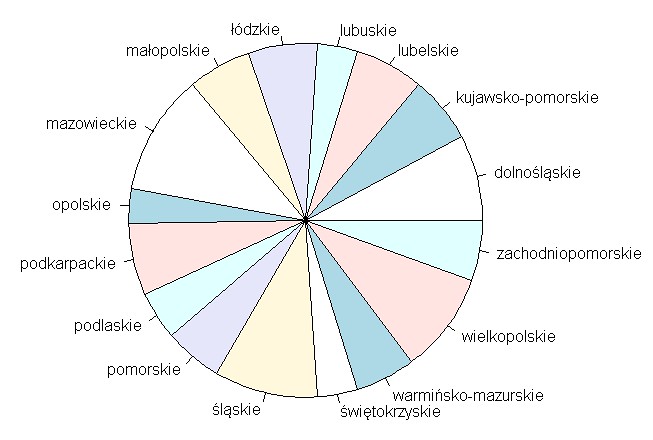
We create a pie chart using the pie() function:
|
1 |
pie(district_sum) |
R has other options for creating graphical representations of data and results. We have shown you the most common ones, familiar from Excel. Recall that we can freely modify graphs with function arguments to best represent the results of our analysis.
With this post, we want to conclude the R basics course. We hope it has helped you learn the basics of this rapidly growing language. If you would like to extend your knowledge from any part of the course, we invite you to contact us via the contact form.
